Ironichna osoba — the author of short, ironic, and sensitive poems called “pyrozhky.” She shares her poetry on Instagram, giving voice to the meanings and feelings we all experience but often don’t know how to express.
PROBLEM
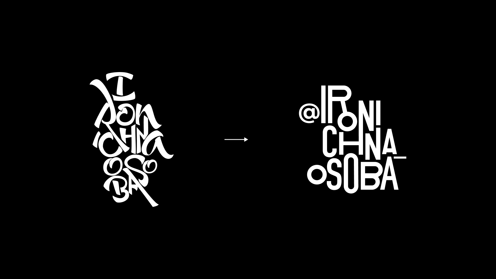
Writing poems came easily and naturally to the author — unlike designing her blog. The previous post style required a lot of work on illustrations and colors. The logo lacked simplicity and structure, and the complicated design distracted from what truly mattered — the words and their meaning.

TASK
We had two main goals: to update the logo and rethink the profile’s visual style.
We had two main goals: to update the logo and rethink the profile’s visual style.
SOLUTION
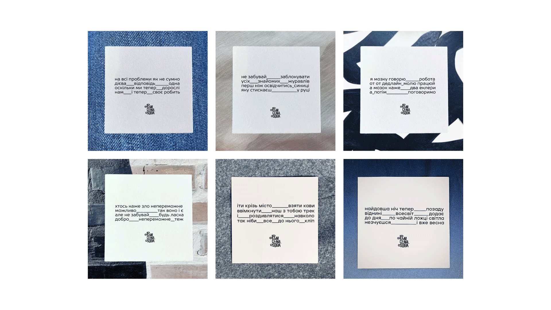
We wanted the design to reflect the unique nature of Ironic Soul’s poetry. Her poems are diverse — tender, ironic, sweet. But always close, rhythmic, and free of pretension.
We wanted the design to reflect the unique nature of Ironic Soul’s poetry. Her poems are diverse — tender, ironic, sweet. But always close, rhythmic, and free of pretension.
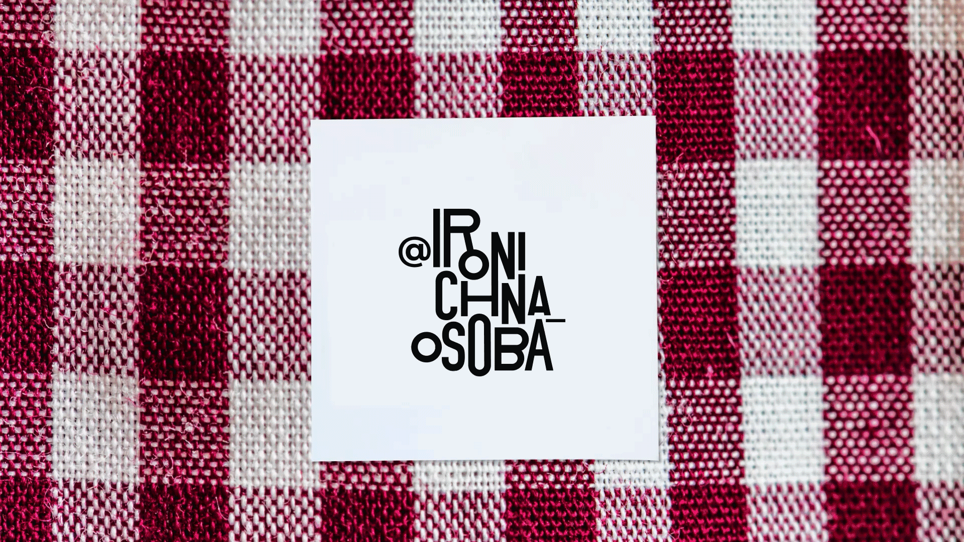
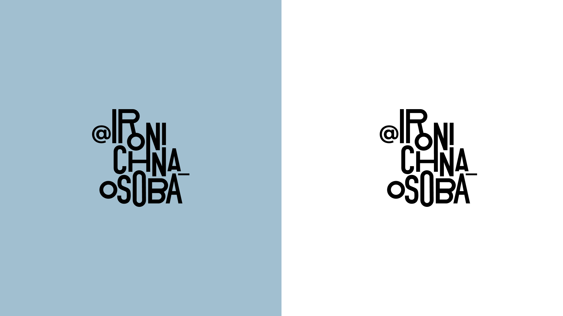
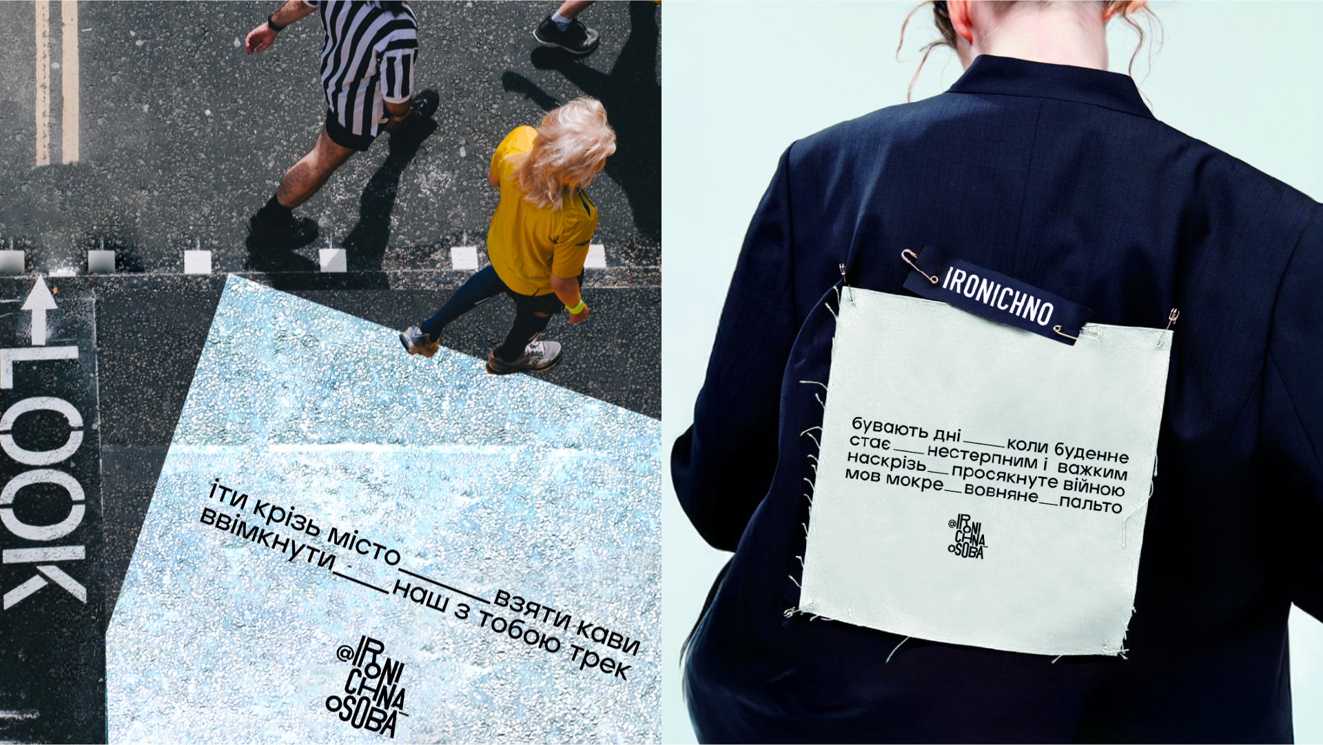
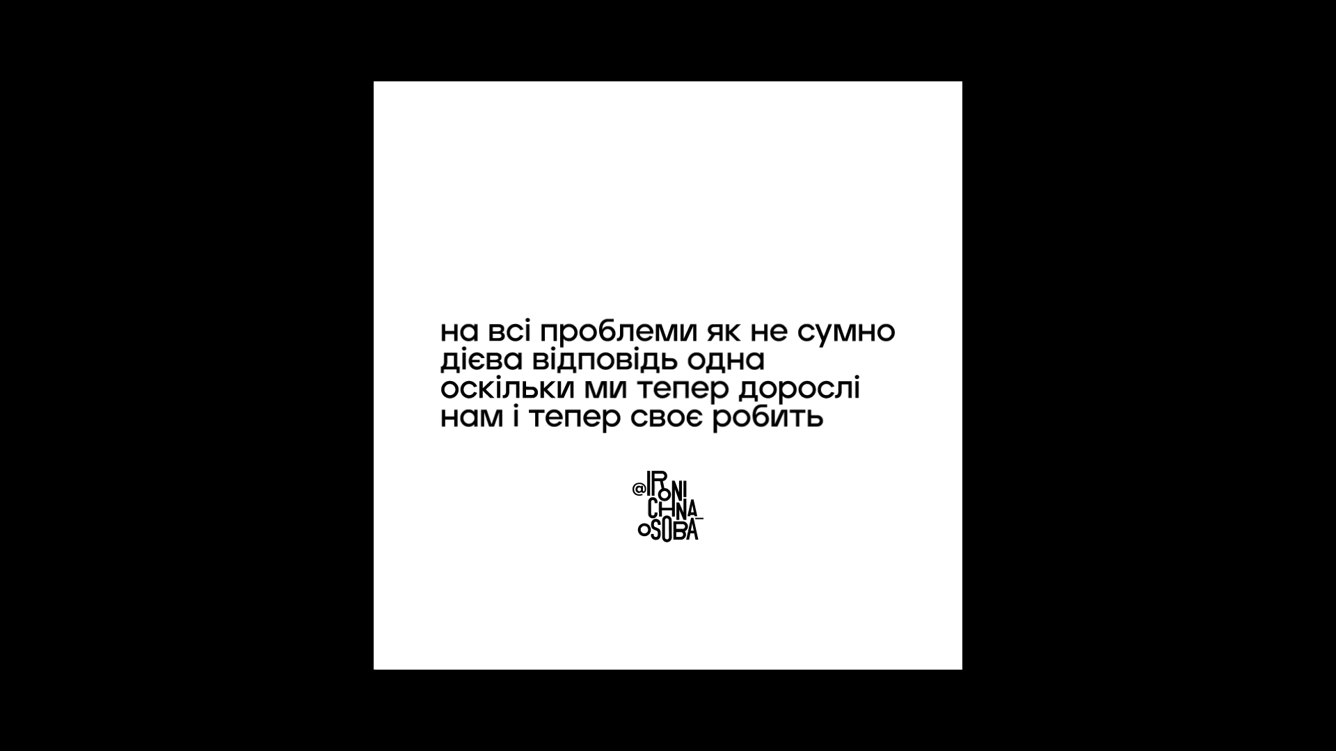
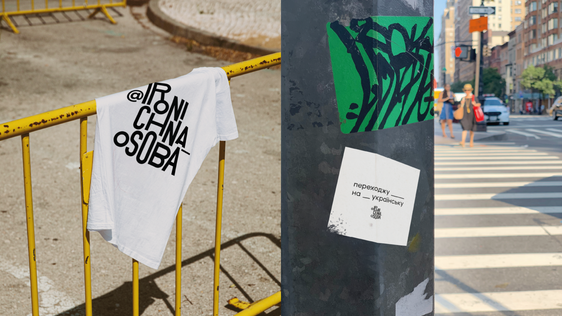
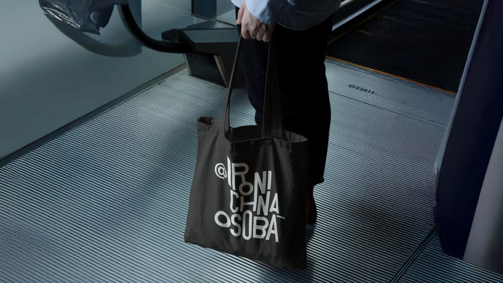
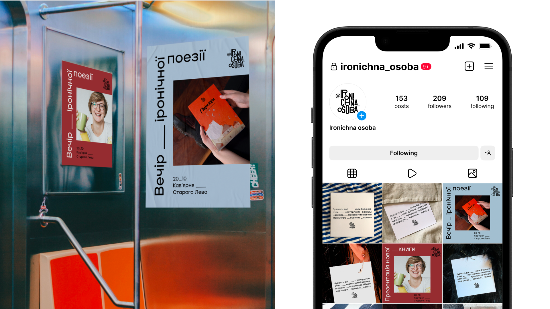
So, we created a logo that embodies the rhythm of her poems. It’s structured, with accents placed exactly where they’re needed.
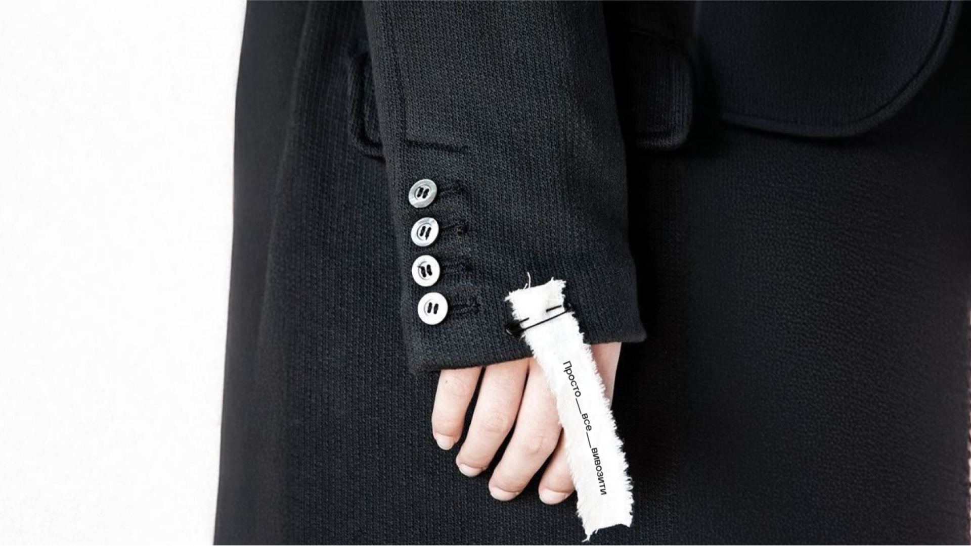
For Instagram, we developed a new style: aesthetic, meaningful, and easy to use. We suggested placing the poem cards on clothing, home textures, or even cats! This way, we show how close Ironic Soul’s poetry really is — it touches the skin, warms like a blanket, or, on the contrary, awakens like cool tiles.
CREATIVE DIRECTION: Artem Beseda
PROJECT MANAGEMENT: Yuliia Stolpnyk
IDENTITY ART DIRECTION: Maria Plotnikova
IDENTITY DESIGN: Olexandra Simkovska
CASE ART DIRECTION: Yuliia Donchuk
CASE DESIGN: Denis Kovalchuk
COPYWRITING: Tetiana Kopytko
SALES MANAGEMENT: Mariia Snihyr

THANK YOU!